The right coffee cup saying can turn an ordinary coffee break into something more personal. It can express a private mood, make a thoughtful gift feel specific, give a brand a memorable touchpoint, or act as a small reminder during a busy morning. The best phrase doesn't just sound pleasant. It fits the person holding the cup, the setting around them, and the way the design will be read.
This collection organizes coffee cups sayings around eight practical situations, from premium quality and convenience to adventure, organic values, craftsmanship, transformation, and community. Cartograph Coffee provides a useful example because its positioning brings together quality, organic convenience, purposeful choices, and coffee for life on the move.
Choose a phrase by starting with the feeling you want to hold. Then consider who will read it, whether it belongs on a ceramic mug or travel cup, how much space you have, and whether the typography supports the mood. A short phrase usually works best on the front, while a longer explanation belongs on the sleeve, reverse, or packaging.
1. Quality in Every Cup
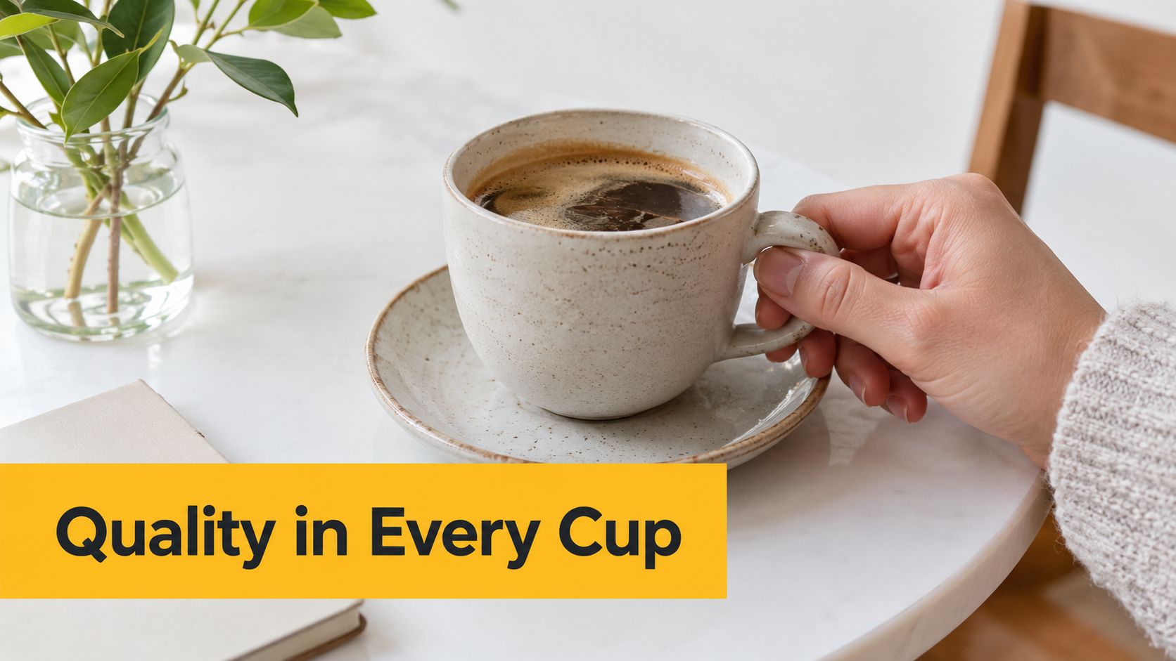
Quality in Every Cup works as a direct promise. It doesn't rely on a joke or a passing trend. The phrase tells a quality-conscious drinker that the contents deserve attention, making it suitable for a premium coffee gift, a tasting set, or a brand cup placed in a refined kitchen or office.
The wording also gives the designer room to create a restrained visual system. Use a substantial ceramic mug, generous spacing, and a typeface with confident proportions. A small origin note, roast detail, or verified certification can sit on the reverse or sleeve, but the front should remain uncluttered. A crowded front weakens a phrase built around precision.
Coffee language has long carried cultural meaning. The phrase “cup of joe” has a documented print trail by the 1920s and 1930s. Britannica notes that “joe” appears to have been used for coffee by 1927, while other histories connect the expression with U.S. naval slang and early commercial coffee culture, as documented in this historical overview of coffee sayings. That history reinforces a useful branding principle: words on a cup can reflect real cultural associations, not just decoration.
Make the promise credible
A quality message only works when the product experience supports it. If you use the phrase with Cartograph Coffee, connect it to claims the brand can substantiate, such as organic positioning, flavor, and attention to the instant coffee experience. The supporting story can point readers toward what specialty coffee means, while the cup itself stays simple.
Design rule: Let the front make one clear promise. Put proof on the sleeve, label, or reverse.
This approach also suits a gift such as a Merry Texmas Bluebonnet coffee cup, where the visual identity can carry regional character without competing with the central message.
2. From Cartograph to Your Journey
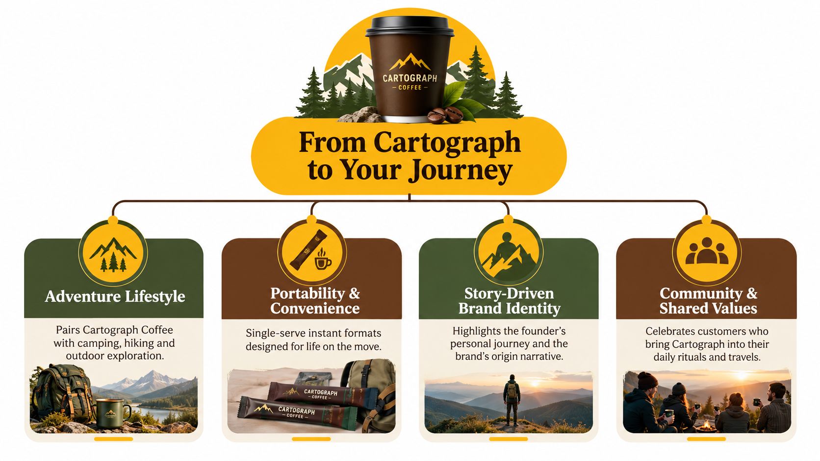
From Cartograph to Your Journey shifts the focus from product performance to movement. It suits someone who carries coffee into changing settings, perhaps from a kitchen to a train, from a desk to a trailhead, or from a campsite to the first stretch of a morning drive. The phrase feels personal because “your journey” invites the owner to complete the story.
This message belongs on a travel mug, compact tumbler, or durable camp cup more naturally than on a formal dining mug. A map line, contour mark, small compass symbol, or destination field can reinforce the idea without turning the design into outdoor merchandise. Keep “From Cartograph” visually smaller if the buyer is the main character. Make “Your Journey” the most prominent line.
The phrase also handles an important trade-off. Adventure language can become overly dramatic when every design suggests a distant expedition. A quieter interpretation works better for commuters, parents, and busy professionals. The journey might be a daily routine, not an extreme trip.
Build a story around the route
A QR code can lead to brand storytelling, brewing guidance, or a customer-submitted travel image. It should support the cup rather than dominate it. Place it on the reverse or sleeve, where the reader can scan it without disrupting the front-facing message.
For a practical companion to this idea, pair the design with Cartograph Coffee's guidance on instant coffee on the go. The phrase then becomes more than a slogan. It reflects a real use case, coffee that fits changing locations without asking the drinker to abandon a preferred routine.
A seasonal version could feature a mountain outline in one release and a city grid in another. The wording remains consistent, while the illustration gives each cup a distinct destination.
3. Better Coffee, Better Communities, Better World
Better Coffee, Better Communities, Better World is the most expansive phrase in the collection. It connects the drink itself with the people and places around it, making it appropriate for a values-led brand, a community event, or a gift for someone who cares about how purchases are made.
Because the phrase has three parts, hierarchy matters. Give “Better Coffee” the largest treatment, then reduce the size slightly for “Better Communities” and “Better World.” Another option is a stacked design with one line per idea, separated by subtle dots or small symbols. Avoid squeezing all three parts into a narrow wrap. The reader should understand the sequence at a glance.
The phrase can also become too broad if the design offers no supporting evidence. Values-based language asks for transparency. A sleeve could explain sourcing standards, partnerships, or specific initiatives, provided every statement is verified and kept current. A link to Cartograph Coffee's explanation of what fair trade coffee means can give the message useful context without overloading the mug.
Give the message a community setting
This saying works especially well for a group order, fundraiser, volunteer event, or limited-edition cup. Personalization can add a neighborhood name, event title, or small illustrated landmark beneath the core phrase. That detail makes the cup feel connected to a real group rather than designed for an abstract audience.
A community message should also avoid implying impact that hasn't been demonstrated. Don't add environmental outcomes, charitable totals, or partnership claims unless the brand can document them. The strongest version is specific, modest, and easy for the cup owner to understand.
4. Instant Doesn't Mean Compromise
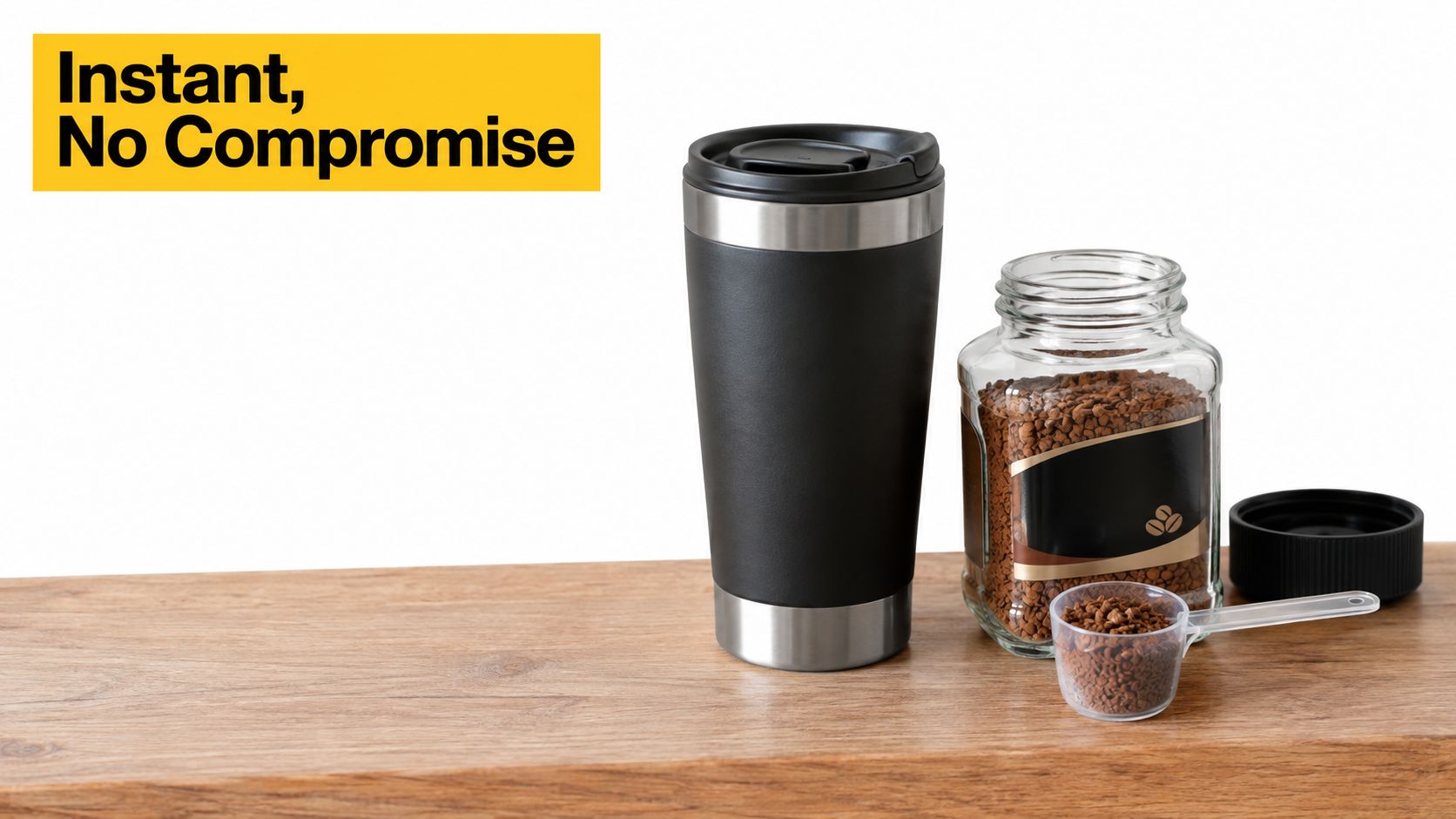
Instant coffee often carries a quality objection before the first sip. Instant Doesn't Mean Compromise addresses that objection directly, which makes it a strong phrase for sampling campaigns, travel packs, office kitchens, and cups used to introduce premium instant coffee to skeptical drinkers.
The tone is confident rather than defensive. It doesn't claim that every instant product tastes identical to every other format. Instead, it frames convenience and quality as compatible. That distinction matters. A design that overpromises creates doubt, while a clear explanation of ingredients, preparation, and flavor gives the phrase credibility.
Use a bold sans serif for the main line, with “Doesn't Mean” in a lighter weight if you want the contrast to read quickly. A small preparation instruction can appear on the back. Keep it practical, such as the amount of water recommended by the product maker and a note about adjusting strength to taste. Don't fill the front with technical detail.
Show the alternative clearly
A sample pack can let the recipient test the proposition instead of reading it. Packaging might pair the saying with tasting notes, an origin description, or a short explanation of how to prepare the coffee. Those details belong beside the phrase, not inside it.
A good instant coffee cup doesn't argue with the drinker. It gives them a simple reason to try the coffee and enough information to judge it for themselves.
This phrase is also useful for workplace gifting. A plain office mug can carry the statement in a clean, professional layout, while a travel cup can use a larger, more energetic treatment. The audience changes, but the central objection remains easy to recognize.
5. Brew Adventure, Sip Quality
Brew Adventure, Sip Quality is active, compact, and easy to visualize. The first verb gives the cup energy. The second half reassures the drinker that movement doesn't mean settling for an uninspiring coffee experience.
This phrase belongs on gear used outdoors, at events, or during travel. Use a line illustration of a trail, tent, road, or sunrise, but keep the image subordinate to the words. A hand-lettered treatment can feel friendly on a camp mug, while block lettering suits a technical travel tumbler. The same phrase can therefore support different audiences without changing its core meaning.
The design should make the action sequence obvious. Place “Brew Adventure” above “Sip Quality,” or use a diagonal path that guides the eye from the first phrase to the second. Avoid overly narrow type. Curved cups distort small lettering, especially around the sides, so keep the primary message within the most visible front panel.
Match the cup to the activity
A lightweight cup may suit a commuter or festival customer. A larger insulated tumbler can serve someone spending extended time outdoors. A classic enamel-style camp cup makes the phrase feel more relaxed and giftable. The saying stays recognizable, but the vessel changes the buyer's interpretation.
Supporting content can show the cup beside a backpack, notebook, or campsite breakfast. The setting should feel achievable. Adventure messaging loses appeal when it suggests that only extreme travelers belong in the story.
Use social posts or event displays to show how the cup moves through real routines. The best image might be a quiet roadside stop rather than a dramatic summit. That broader approach keeps the saying relevant to campers, commuters, and anyone who wants a better start before leaving home.
6. Organic Excellence, On the Go
Organic Excellence, On the Go brings together two priorities that shoppers often consider separately. “Organic Excellence” speaks to standards and product choice. “On the Go” speaks to portability, time pressure, and the need for a coffee solution that fits real routines.
The phrase works for a wellness-oriented customer, a parent packing a morning bag, or a professional moving between work and home. It also suits a travel cup better than a decorative mug because the portability promise is part of the message. Use natural colors, open space, and restrained botanical details. Avoid excessive leaf imagery if it makes the design look generic.
Certification language requires care. Only display a certification mark when the product is eligible and the use is authorized. The same applies to statements about ingredients, farming, sourcing, or production. A beautiful cup can't repair an unsupported claim.
Keep convenience visible
A common mistake is allowing “organic” to dominate so completely that the cup stops communicating ease. Give “On the Go” enough visual weight to show that the product belongs in a car cup holder, work bag, or campsite kit. A small icon of a pack, route, or travel lid can support that idea without making health claims.
The phrase also benefits from a softer tone than the instant-quality message. Use rounded lettering or a warm serif if the audience values calm and natural living. For a more professional customer, use a clean sans serif and a small line of supporting copy on the reverse.
Personalization can include a first name, a daily destination, or a short routine marker such as “commute,” “trail,” or “school run.” Keep those details secondary. The central phrase should remain readable when the cup is moving through a busy morning.
7. Crafted by Passion, Designed for Purpose
Crafted by Passion, Designed for Purpose gives a brand-heritage message a practical finish. “Crafted by Passion” communicates care and commitment. “Designed for Purpose” tells the buyer that the product has a reason for being, not just an attractive surface.
This phrase suits a founder-led business, an artisan collaboration, or a gift for someone who prefers thoughtful products over mass-market novelty. It works particularly well on a matte ceramic mug with a small mark, restrained color palette, and generous margins. The design should feel considered rather than rustic by default. Craftsmanship doesn't require distressed type, faux handwriting, or decorative clutter.
A short founder note can appear on the packaging or reverse. It might explain why the product exists, who it serves, or how the business makes decisions. That story should be factual and specific. If the cup refers to a seasoned food-industry professional, a dedicated parent, or a purpose-driven operating philosophy, those details should match the publisher's own brand information.
Let the object show intention
The phrase can also work as a collaboration template. Add the name of a maker, camp outfitter, independent shop, or event beneath the main line. Use a small illustration that reflects the partnership, such as a topographic mark, local plant, or workshop tool.
Don't make “passion” do all the persuasive work. Buyers respond better when the design pairs emotion with useful information. Place preparation guidance, ingredient details, or a founder story on the sleeve. The front earns attention; the supporting material earns trust.
For a gift, add a date or occasion discreetly on the base or reverse. That preserves the main message while creating a keepsake that feels made for one person rather than pulled from a generic slogan list.
8. One Cup Changes Everything
One Cup Changes Everything is the most aspirational saying here. It treats the cup as a starting point for a better habit, a more deliberate purchase, or a larger shared purpose. That makes it emotionally strong, but also more demanding. The design must clarify what kind of change the phrase points toward.
For a personal mug, the message can represent a morning reset, a new project, or a commitment to choosing quality and convenience together. For a brand cup, supporting copy should connect the statement to substantiated product and community values. Don't imply that a single purchase automatically creates a specific social or environmental outcome unless the business can explain and document that outcome.
A circular composition can make the phrase feel transformational. Place “One Cup” at the top, “Changes” in the center, and “Everything” below, with a small sunrise, route, or community symbol tying the lines together. Keep the central words large enough to read across a table.
Use transformation without exaggeration
The phrase can anchor a limited edition tied to a real launch, community gathering, or customer story. A name, destination, date, or short handwritten-style note can personalize the design. The added detail should show what changed for a real person or group, not make a vague promise about everyone.
This saying also works on a gift box, where the cup becomes part of a larger ritual. Include a note about the recipient's next step, such as a new job, first camping trip, or morning routine. The result feels more meaningful than a generic inspirational mug because the transformation has a clear context.
Turn a Good Saying Into a Great Mug
A strong phrase is only the beginning. The mug has to make that phrase easy to read, appropriate for the drinker, and believable within the surrounding brand or gift context. Start by matching the message to the setting:
- For a premium kitchen or tasting gift: Choose Quality in Every Cup and use restrained typography, spacious margins, and verified supporting details.
- For travel and commuting: Choose From Cartograph to Your Journey or Brew Adventure, Sip Quality, then add a route, destination, or small map detail.
- For an office or sampling program: Choose Instant Doesn't Mean Compromise, with preparation guidance and product information on the reverse.
- For an organic and wellness audience: Choose Organic Excellence, On the Go, but use certification and ingredient language only when it can be substantiated.
- For a values-led gift or community event: Choose Better Coffee, Better Communities, Better World or One Cup Changes Everything, then explain the relevant purpose clearly.
- For a founder-led or artisan design: Choose Crafted by Passion, Designed for Purpose and support it with a concise origin story.
Front-facing text should usually be the shortest readable version. A long sentence may look impressive in a design file but become difficult to scan once it wraps around a curved cup. Reserve origin details, brewing instructions, sourcing information, and impact explanations for the sleeve, reverse, packaging, or a linked landing page.
Typography should reflect the mood. A strong sans serif feels direct and modern. A warm serif can suggest quality or heritage. Hand lettering can make an adventure or gift design feel personal, but it needs enough weight and spacing to survive printing. Test the phrase at the actual cup size, not only on a large screen. Check it from the distance where someone will normally hold or see the mug, and inspect how the words sit near the handle.
Personalization adds value when it stays subordinate to the core saying. Try a name, destination, date, trail reference, or small illustration. One meaningful detail usually works better than several decorative additions. A design that says Quality in Every Cup with a recipient's name beneath it feels more intentional than a mug crowded with icons, colors, and secondary slogans.
Material and finish matter too. A glossy ceramic mug supports a polished premium message. A travel tumbler suggests movement and convenience. A camp-style cup makes adventure language feel natural. If you plan a wrap or transfer, review the production method before finalizing the artwork. This UV DTF cup wrap guide can help you think through placement, surface coverage, and how the design will behave on a finished cup.
Cartograph Coffee-related designs should connect quality, organic convenience, adventure, or community language to claims the brand can support. The global market context also shows why message-led drinkware deserves careful differentiation. One 2026 report estimated the coffee mugs market at USD 6,140.7 million in 2024, with a projection above USD 11,982.3 million by 2033, while another market source valued the broader mug market at USD 28.09 billion in 2024 and projected USD 58.05 billion by 2032. Those figures come from separate market reports, one focused on coffee mugs and one focused on sublimation blank mugs. The practical lesson is simple. Quote-based drinkware sits in a substantial gifting and personalization category, so originality, audience fit, and readable design matter more than adding another familiar phrase.
Choose the saying first, then design the cup around the person who will use it. If the words feel specific to that drinker, the mug becomes more than a container. It becomes part of the morning, the journey, the gift, or the brand experience.
Comparison of 8 Coffee Cup Sayings
| Tagline | 🔄 Implementation Complexity | ⚡ Resource Requirements | 📊 Expected Outcomes | 💡 Ideal Use Cases | ⭐ Key Advantages |
|---|---|---|---|---|---|
| Quality in Every Cup | Low, simple to deploy; must ensure consistent product delivery | Moderate, quality control, packaging, possible certifications | High, builds trust and premium perception | Premium packaging, flagship SKUs, quality-focused marketing | Clear quality promise; memorable and repeatable |
| From Cartograph to Your Journey | Moderate, needs cohesive storytelling strategy | Moderate, content creation, influencer/travel partnerships | High, strong emotional loyalty and UGC potential | Travel retail, outdoor campaigns, QR-linked story content | Creates emotional connection; emphasizes portability |
| Better Coffee, Better Communities, Better World | High, requires programmatic CSR and transparency | High, partnerships, impact programs, measurement/reporting | High, deep values alignment; supports premium pricing | Cause marketing, impact reports, limited-edition releases | Triple-value positioning (product, people, planet) |
| Instant Doesn't Mean Compromise | Moderate, needs proof points, demos, education | Moderate, sampling, tasting events, R&D validation | High, reframes category; converts skeptics | Tasting events, specialty retail, comparison packaging | Tackles stigma directly; builds credibility for instant |
| Brew Adventure, Sip Quality | Low, action-oriented creative; relies on visual execution | Moderate, dynamic imagery, event activations, sponsorships | High, engages active lifestyles; memorable branding | Outdoor events, adventure partnerships, social content | Energetic, dual-benefit messaging (convenience + taste) |
| Organic Excellence, On the Go | Moderate, requires certification and supply-chain controls | High, organic certification costs, verified sourcing | High, trusted by health-conscious buyers; premium justification | Natural food retail, commuter packs, wellness channels | Strong organic credibility; appeals to wellness consumers |
| Crafted by Passion, Designed for Purpose | Moderate, ongoing founder storytelling & heritage content | Moderate, behind-the-scenes content, packaging notes | High, builds artisanal brand loyalty and perceived quality | DTC storytelling, boutique retail, specialty collaborations | Emphasizes craftsmanship and authentic origin story |
| One Cup Changes Everything | High, demands measurable impact and continuous reporting | High, impact tracking, program funding, partner vetting | High, powerful advocacy if substantiated; risk if unproven | Social campaigns, impact reports, loyalty tied to outcomes | Highly aspirational; mobilizes values-driven consumers |
| (Overall), Use as Mix & Match | Variable, combine simple lines with mission-driven elements | Variable, allocate resources per chosen mix | Variable, balanced approach can optimize reach and trust | Cross-channel campaigns, seasonal themes, packaging tiers | Flexible: combine clarity, purpose, and adventure to target segments |
Cartograph Coffee offers organic instant coffee built around quality, flavor, convenience, and purposeful everyday use, whether you're at work, at home, or outdoors. Visit Cartograph Coffee to find coffee that gives your favorite cup saying a practical reason to be there.